Toyota Avensis test drive 2003 - 2006 sedan
Grouped to business class
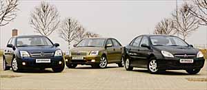 With each new generation, the size of passenger cars increases. This trend that has developed over 20-30 years turns the once relatively modest segment cars D almost into the flagships of its model range. And the last generation of sedans in size, equipment and quality without stretch can be called a business class.
 It is interesting that over the past 2-3 years, almost all automakers in class D have changed models. There are few veterans. Unless the next Passat is not yet arrived in the eternal standard. Therefore, the choice for both the buyer and the tester here is very wide. In order not to harass ourselves with doubts, we decide, blindly poked a finger at the map, take the German, the Frenchman and the Japanese. And it is desirable that their dimensions, weight and power supply be one to one. This is not always simple, especially considering that living cars this season are indulged and in salons it is rarely possible to find the entire model gamut in free sale. But we were lucky in the test, almost the same in characteristics, the new Toyota Avensis 2.0 (147 hp) and Opel Vectra 2.2 (147 hp) with a 2-liter Citroen C5 (136 hp). This model from the homeland of musketeers, although it is not a novelty, nevertheless dates back to the 21st century (2001) and has not yet been blessed in design. The whole trinity with machine guns, but, as it is now generally accepted, allowing the opportunity to manually control.
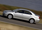
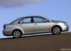
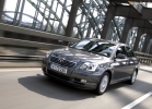
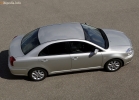
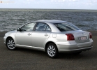
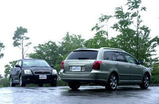
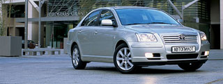
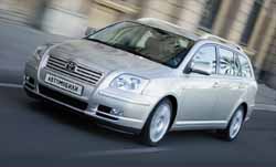
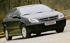
Even at first glance, it is noticeable how much in common has Vectra and Avensis. Although, perhaps, on the contrary, Toyota looks like Opel, because this model appeared later. Previously, it was such an expression on the face with the original anterior optics. But let's still consider this a coincidence, often fresh ideas appear in several heads at once. With the rear, the cars have much smaller cars. And in the profile, the pronounced wedge of Opel is opposed by the obvious facet of Toyota's chubby with its highly curved waist line. This slightly resembles those models (say, Crown) what the Japanese do for their domestic market. But C5 has a clear advantage by the criterion of recognition: even a person far from the automobile world does not confuse him with anyone. Environmentally friendly forms resemble only about Salvador Dali and ... about Citroen himself with his rich history.
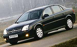 If you get carried away, then we can talk about successes and shortcomings, originality and secondaryness for quite some time. But then everyone strives to act as a judge and critic, call on BIS and stomping their feet. Nevertheless, I risk expressing the opinion that Vectra is drawn most clearly, with family recognition and with an undisguised desire to set a new tone for a sports and tough image of the brand, previously considered inexpensive and philistine. As for Toyota, it was even outwardly noticeable, as they tried, they even climbed out of the skin, designers to make beautifully. And if you do not switch to the language of high automobile fashion, condemning even a hint of kitsch, then Avensis clearly succeeded. Especially against the background of absolutely neutral predecessors. But it is generally difficult to judge Citroen by common standards, the traditions of the brand and style of a heavy load affected the authors of the design. But, in my opinion, especially against the background of a c3, a firm and obviously talented hand, the five looks somewhat amorphous and vaguely. I also note that outwardly C5 looks at a overgrowth, more weighty and bulky than Avensis and Vectra. But, looking at the table, you will see that the class of all three cars is absolutely identical. Illusions of vision, you understand ...
 The filling of the salon at the whole trinity is completely different. Here it is difficult to compare as green with square. OPEL TECHNODS. All black, even gloomy, dense, perfectly fitted. A thick stylish steering wheel with four faceted knitting needles. Noise insulation perfectly deaf, as in a tank. All pens on the panel are similar, and to confuse them is simple. Which I did constantly. If you want to add the volume of the radio, the temperature of the blowing grows. By the way, about the trunk. If there is an appropriate key in the cabin, then the lug compartment cover should open when pressing? Nothing like this! We must also press the round button under the lid. Unknown.
Opel Vsetra
+

Thoughtful interior
Great visibility and sense of dimensions
Excellent acoustics
–


Bamper low apron
Turning switch without fixation
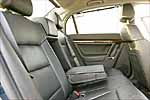
Opel seats, albeit comfortable and absolutely not tired of me in a couple of days driving with a dense schedule, are almost flat. But the second row is generally a smooth bench. Sitting not closely, but the crown takes out to the ceiling. Another car that came to us is a cool Hi-Fi. Even the radio gives such a clear and deep sound with a strikingly wide frequency range that you are sometimes distracted from the driving process. The result of interior digging in the new vector can be formulated as follows: the highest German quality and quality, brought to the limit, care and love for the driver and passengers, expressed in every little things, but the absence of a highlight in style. The panel here is fresh, boring.
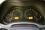
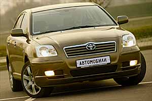 Dive to Toyota. Despite other stylistic solutions other than in Opel, there are surprisingly much in common with him. This is especially true for the quality of plastic and gap accuracy. Bravo! Avensis New has become a completely European car. Japanese secondaryness and distinction have almost disappeared. Almost. Still, it is noticeable that many decisions did not ripen evolutionarily, but are spied on the most quick and advanced manufacturers. A picky look will pay attention to the color discord: there is black, there is light, here under aluminum; The symbols are white, and the edging is chrome. The desire to embrace the immense. If you do not put the originality of the design at the forefront, Avensis is an ideal student who surpassed many teachers. Everything is done solidly, in an adult way.
 And with what sound the doors are slammed! You will pull the handle lightly, you only shift the heavy door from the place, and she, looking, and already snapped with a delicate clasp, and immediately and completely. Reference. But the steering wheel, although sheathed with good skin, is thin. As well as the KP lever. Definitely under a miniature ladies' handle sharpened. It seems that it is not fundamentally: the machine gun turned on at the beginning of the road, but on the return, I put it on R. But no, here you can twitch your hand +, and the lever in the fist is lost ... in the decoration of the expensive version, a plastic tree is used (as well as in Vectra ). What, in my opinion, looks bad for fake, and everything else is real! Deep cozy chairs, the scope of especially behind, for the legs. But the places above the head in the second row are less than that of competitors, I personally were uncomfortable here. I had to bend.
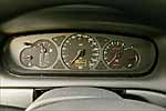
The third competitor C5 in the interior decoration, I admit honestly, was not too pleased ... there is a feeling that his salon was developed without looking at the change of the last 20 years. You will find such rough, gray and unfriendly plastic only on American SUVs and on dwarf machines, where it is possible to save on cost and provide a price acceptable for the student by the finish. But on the flagship?! Again, I will turn to my sweet heart to the baby C3 in terms of the level of execution of the car seemed to have changed places!
Toyota Avensis
+


The quality of the finish
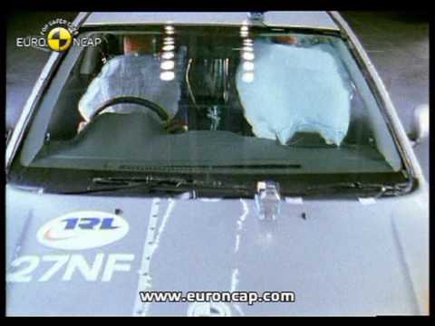
9 (!) Safety pillows
Sinless engine
–

Phlegmatic temperament
To soften the level of criticism, I note that the Citroen salon is spacious, like none of the competitors. You can sit anywhere in a hat, and if you want to collapse. Here it was clearly possible to find a compromise between streamlines and the internal volume. But in all other things ... of unimportant quality, the steering wheel switches that strive to stay in your hands, poorly fixed buttons, slurred to the touch. Incrediently panoramic mirrors and almost tank narrowness of the embrasure of the rear window. The automatic transmission lever moves along the Merced -like zigzag. Its plastic spitting under the chrome has such a cutting front edge, which falls directly under the fingertips, which you will soon need a patch. Although this is perhaps a feature of a particular copy. Another hit of impermanality is the inner hands of the doors. Someone's cunning fantasy unfolded the plane of their opening by 90 ° Horizontally. So it turns out to pull the handle, but you will have to push the door either with the second hand or elbow. Absurd...
But the driving qualities of large sedans, like all solid machines, are much more neutral, reduced for a certain average standard.
 To the best of the dynamic responsive Opel pleased the most adequate control (the only minus slightly lazy entry into a turn). In the vector, the manual mode of the box is most convenient: the lever goes like clockwork, and the reaction to switching instant. But here I can not do without comments. The first applies to the steering wheel control of the turn signals. The lever is not fixed here, and after pressure begins to click as much as it pleases. He himself understands when you pulled the steering wheel in the opposite direction. But it’s unpleasant what is being done in addition to your will and not always in a timely manner. The second claim is a purely geometric extremely low apron of the front bumper: on the curb, the face can only be put.
 Avensis behavior is ideal, otherwise you can’t say. Unless I would like more dynamics. But in theory, there are much more rotten versions of 1.6 and 1.8. Well, the dimensions in Toyota are felt worse than that of competitors, despite the identity of the size. Of the entire trinity, Avensis stands out the most solid, representative behavior on the road. He is impositional and smooth. And most importantly, obedient.
I will not be original if I say that many small skitro blows are redeemed sometimes sometimes indispensable in domestic conditions by hydropneumatic suspension. The situation: in one of the three rows, the Muscovite broke, and in the other stood up to turn the bus to the left (of course, on the oncoming man, no one would miss the stream to God, not in America!). And in the only traveling row, Davka and Chaos. Competition three to one. I slowly roll up to the right tall border and press the button up. It is inconvenient, of course, that the indication on the scoreboard about the level over the asphalt is only an indirect arrow up/down, but in the surrounding objects I notice that it is growing. Under the surprised-browned glances of drivers languishing in the battles and frying passengers, C5 easily crawls onto the sidewalk 20 centimeters with a gac. Traffic Side. The Grand Grand, which was following me, does not decide on the same feat with obvious disappointment and it doesn’t hurt with a look and it is necessary to dig into the thick of the thick. C5 has a colossal angle.
Citroen C5
+
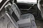
Fat plus changing clearance
Spacious salon
–

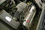
Long minus interior decoration
Did you want conclusions? Me too. But I don't know your priorities. And everyone has different views. And the choice is always yours. Buyers who vote with money are quite massively bought up by opening and Toyota, but Citroen does not bypass the Citroen.
OUTSIDE:
With the examples of this varied trinity, you can safely illustrate the dynamics of the development of a modern style. Judge for yourself: Citroen Swan Song Biodesign Song of the late 80s, Opel is a fairly tough technique of the beginning of the new century and, finally, Toyota is soft and even slightly decorated, which has been in fashion recently. In terms of recognition of Brand, indisputable leadership remains with the Japanese car, the design of which is also corporate, which is especially appreciated by modern standards. The gaze of headlights Opel and Toyota is similar, and both cars equally start it a little up, which, however, on the hand of Citroen, whose look is archaic and in itself is little expressive. Due to the addiction of Vectra to the style of techno, the architecture of the main volume of the body and its plastic loses to the rest in dynamics, but they make the composition of the car whole. In addition, Opel demonstrates in German verified and geometrically clear lines absolutely circular arches of the wheels and the directness of the lines that draw the wedge of the windowsill. Compared to this, Citroen's plastic looks softer, not to mention Toyota, which, although less dynamic, is plastic, is soft and even looks even imposingly from this.
The Citroen C5 is a low -growing and aquadine design does not look so bad, but only for those who do not know the history of the company.
Assessment 4
Opel Vectra is a high -quality and integral design that distinguishes a German school of recent years. As for the style of the techno, it is so far in fashion.
Assessment 5
Toyota Avensis is a very high -quality and modern design, which just needs to be looked at, but only then draw conclusions.
Assessment 5
INSIDE:
By the nature of plastic and style, the interiors of Opel and Toyota demonstrate a rather close relationship with their external design. And this is a big plus. Plastic panels of the instruments and upholstery of the Citroen doors are different. Unlike the exterior, it is defiantly stylish. What is the only X-shaped stroke of lines that organize the drawing of the central console! The Opel interior style is strict and straightforward and in many ways resembles a little conservative, but very solid style of the Grundig, trimmed TVs of the late company. In Japan, for a long time without a navigation system, no one has been traveling even around the native city. Therefore, the multifunctional screen, which is hidden in the upper cover of the Toyota instrument panel, is given an important compositional place. As a result, the screen even rises above the combination of devices, and the organization of the entire central console is pulled to it. The rudders are solid and four -spokes, without a share of a hint of temperament. The doors are appropriate: Citroen has a dynamic take -off line of the upholstery connector, decorated with a wooden lining, can recall the design of a hot sports compartment, and the prudence of the functional construction of the Opel door is more expensive models representing the classics of German automobile design.
Results:
Citroen C5, unlike the exterior, everything is fulfilled very emotionally, which will delight fans of the traditions of the company.
Assessment 5
Opel Vectra is a whole solution that, due to excessive straightforwardness, may seem annoying and dry. Professionalism, purity and quality of execution saves the situation.
Assessment 5
Toyota Avensis is a very modern and stylish solution that fully meets both the requirements of high design and the modern level of its class.
Assessment 4
THE OVERALL RESULT:
Citroen C5 4
Opel Vectra 5
Toyota Avensis 5
Text Vladimir Smirnov photo Alexander Nozdrin
A source: Cars
Toyota Avensis Crash Test Video 2003 - 2006
Toyota Avensis 2003 test drives - 2006
Toyota Avensis Crash Test 2003 - 2006
Krassh Test: Detailed Information34%
Driver and passengers
8%
Pedestrians

